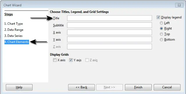
When a chart is created, then in the ‘Chart Wizard’, under the ‘Chart Elements’ tab, we have the option to add a ‘Title’ for the chart. Appropriate title can be added in this tab during the creation of the chart.


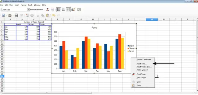
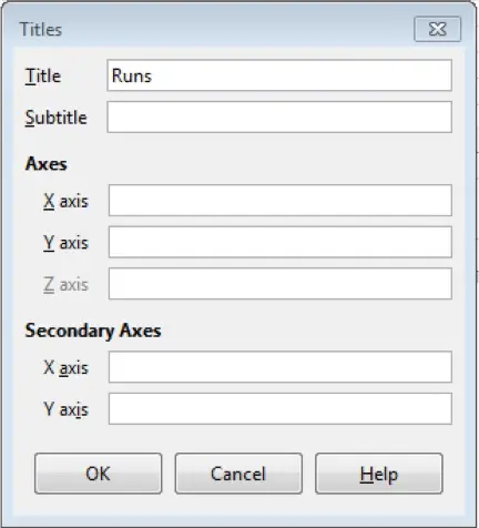
Another way is to first create a chart, then select it by double clicking, and then right click on the chart area. This gives a menu from which ‘Insert Titles’ can be selected. This gives a ‘Title’ dialog box from where we can add a title, remove a title and also edit the title. If the title is already there, just delete the title and click on ‘OK’. This will remove the title.
Similarly, by changing the title and clicking on ‘OK’, we can edit the title.


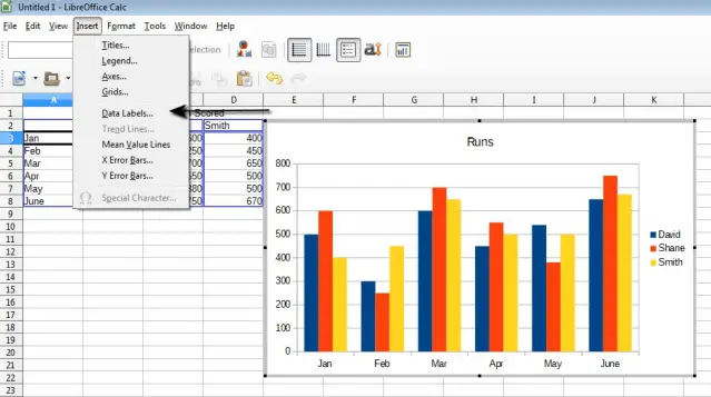
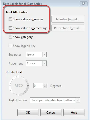
Add data labels to a chart: values/numbers, percentages.
To add data labels to a chart, select the chart by double clicking on it. After selecting the chart, click on ‘Insert’ button from the main menu bar and then click on ‘Data Labels’ from the resulting drop down menu. This will open the ‘Data Labels for all Data Series’ wizard. Under ‘Text Attributes’, we can check or uncheck the number or percentage data labels as per the requirement.


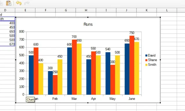
If the ‘Show value as number’ checkbox is checked, then the output will be as follows.

Change chart area background color, legend fill color.
To change the chart area background color, first of all select the chart by double-clicking on it. A grey border should surround the chart upon selection. After this, right click on the chart area and from the resulting menu, click on ‘Format Chart Area’. This will display the ‘Chart Area’ dialog box.
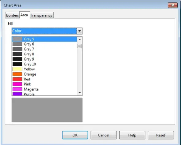

In this dialog box, under the ‘Area’ tab, we have a ‘Fill’ drop down list. From this list, select the appropriate color which is required for the background of the chart and click on ‘OK’. This will change the chart background color.
To change the chart legend fill color, first of all select the chart by double-clicking on it. A grey border should surround the chart upon selection. After this, right click on the legend area, the area where the legends key is displayed, and from the resulting menu, click on ‘Format Legend’. This will display the ‘Legend’ dialog box.
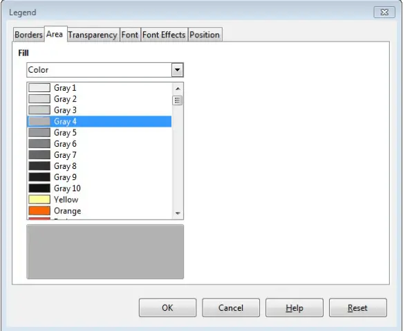

In this dialog box, under the ‘Area’ tab, we have a ‘Fill’ drop down list. From this list, select the appropriate legend fill color and click on ‘OK’. This will change the chart legend fill color.