Change the column, bar, line, pie slice colors in the chart.
To change the column, bar, line, or pie slice color in a chart, simply double-click on the respective element for which you want to change the color. If it is a bar chart, double-click on the individual bar, and if it is a pie chart, double-click on the pie for which the color is required to be changed. Do likewise for the other chart types. This double-clicking will open the ‘Data Series’ dialog box.


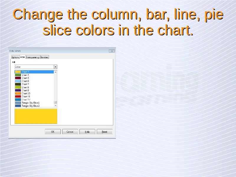
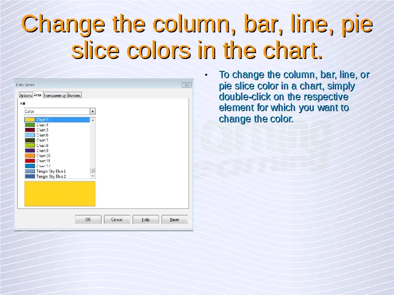
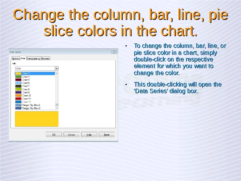
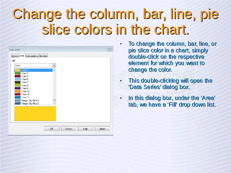
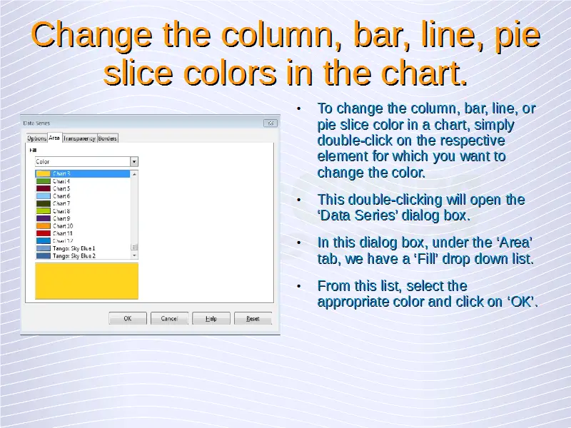
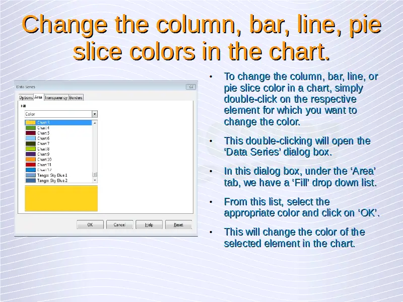


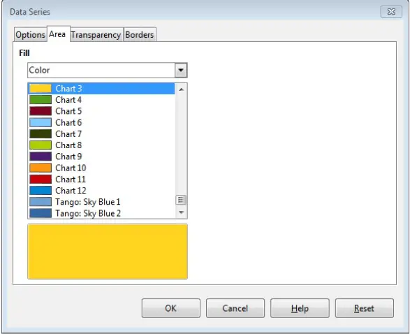
In this dialog box, under the ‘Area’ tab, we have a ‘Fill’ drop down list. From this list, select the appropriate color and click on ‘OK’. This will change the color of the selected element in the chart.
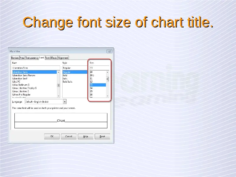
Change font size and color of chart title, chart axes, and chart legend text.
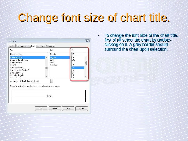
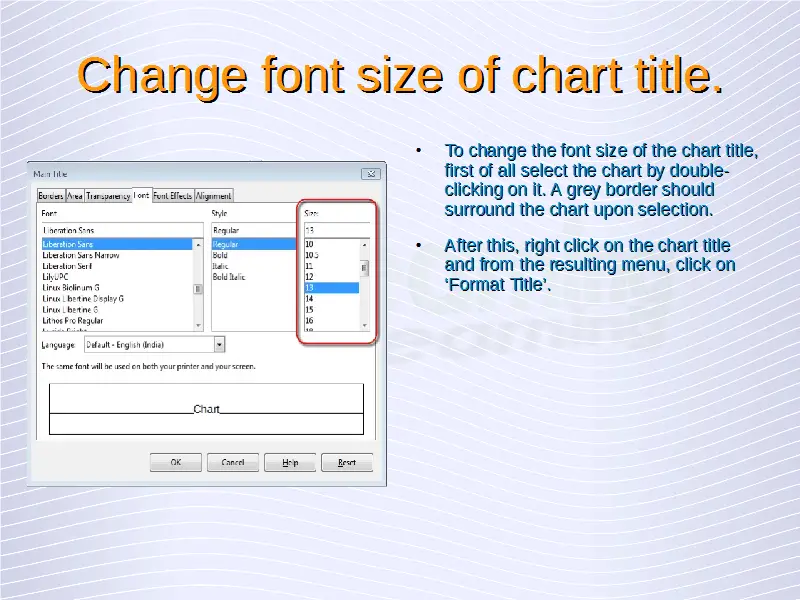
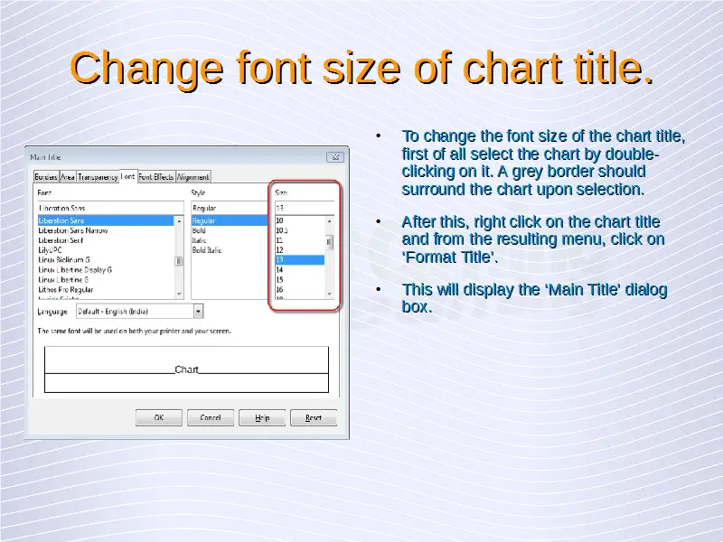
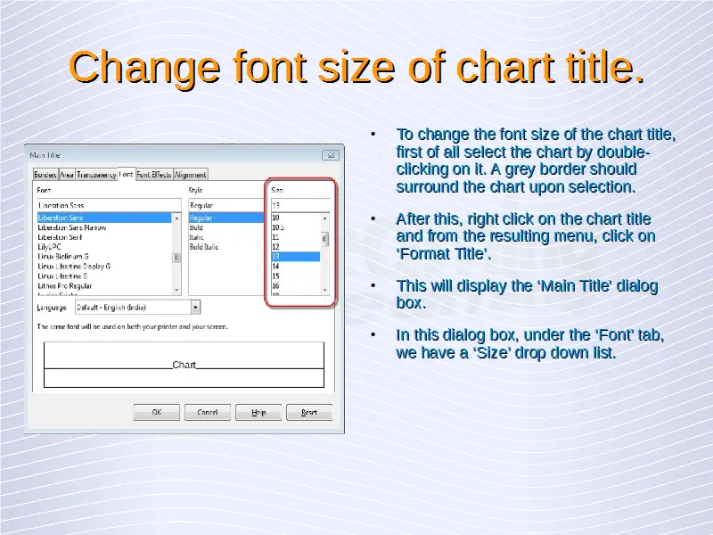
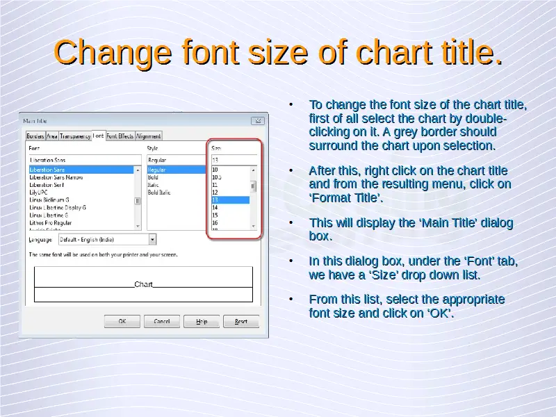
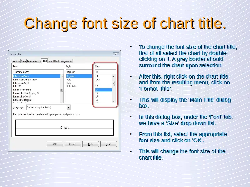
To change the font size of the chart title, first of all select the chart by double-clicking on it. A grey border should surround the chart upon selection. After this, right click on the chart title and from the resulting menu, click on ‘Format Title’. This will display the ‘Main Title’ dialog box.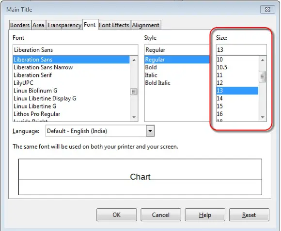

In this dialog box, under the ‘Font’ tab, we have a ‘Size’ drop down list. From this list, select the appropriate font size and click on ‘OK’. This will change the font size of the chart title.
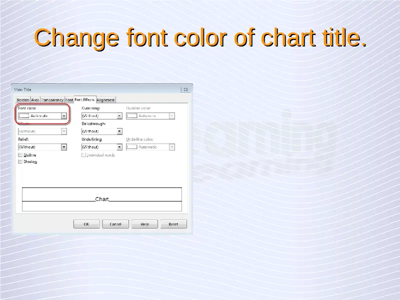
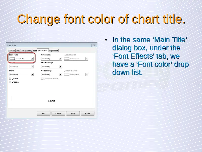
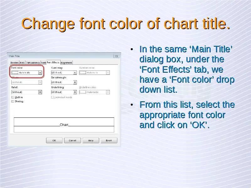
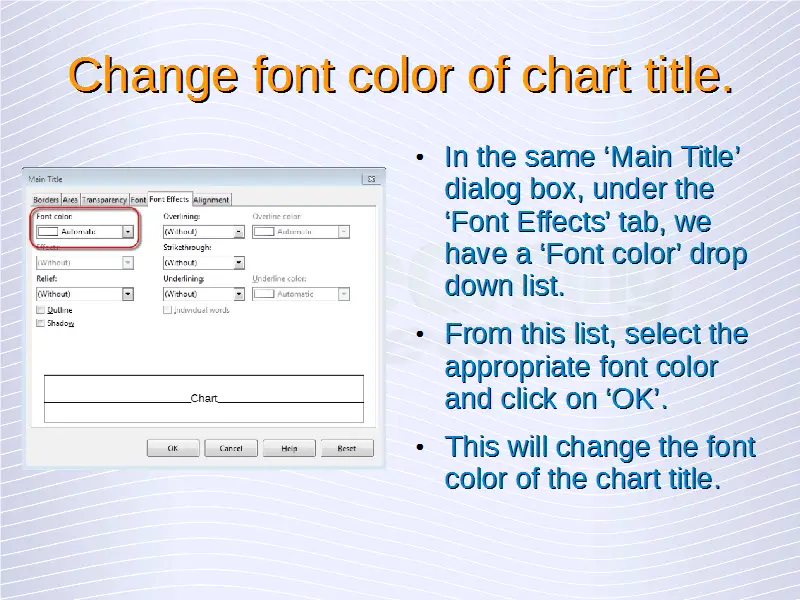
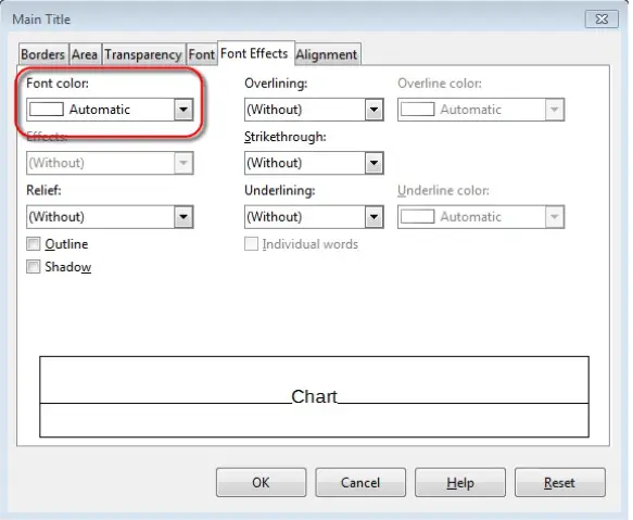
In the same dialog box, under the ‘Font Effects’ tab, we have a ‘Font color’ drop down list. From this list, select the appropriate font color and click on ‘OK’. This will change the font color of the chart title.

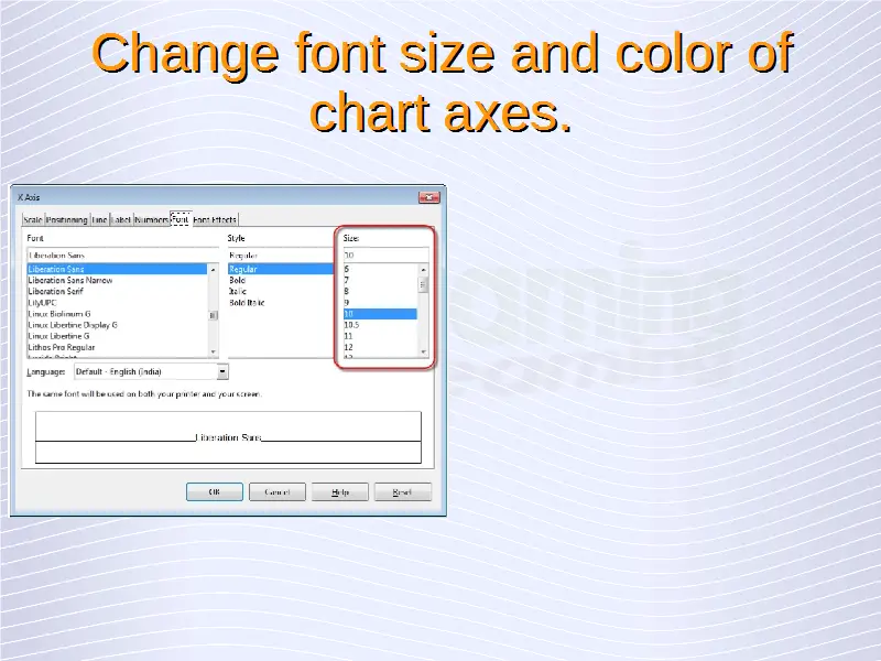
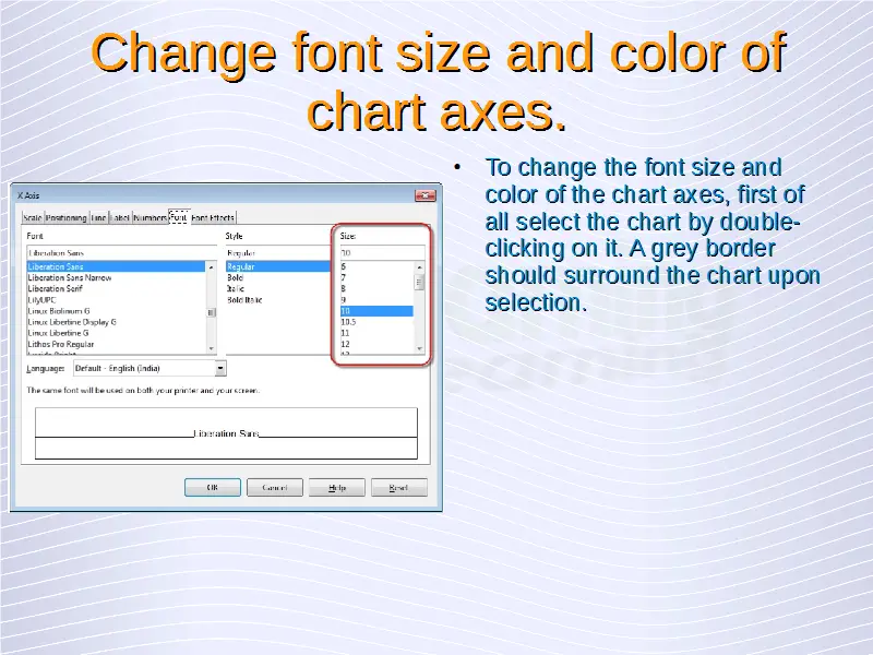
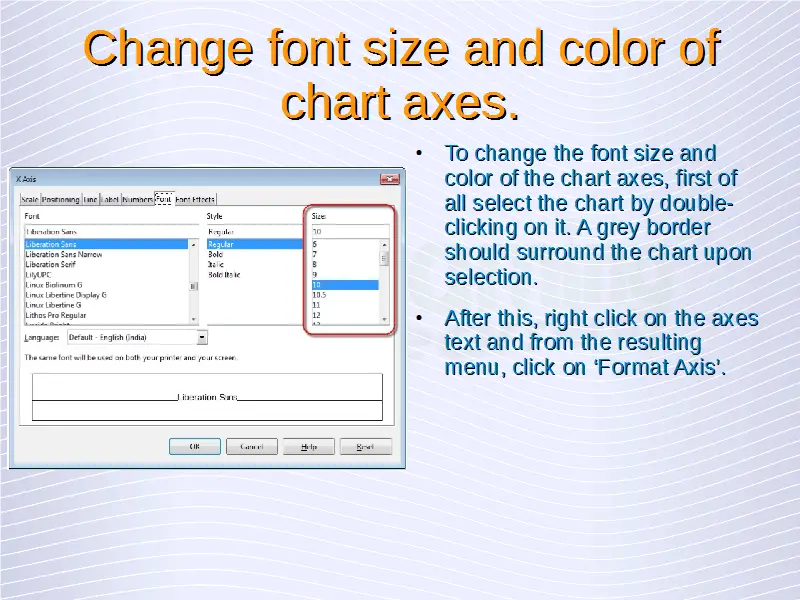
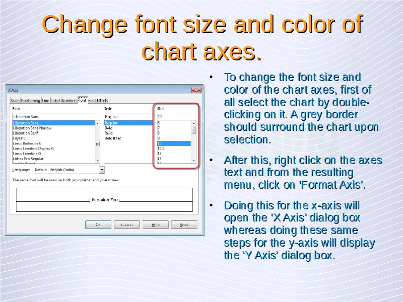
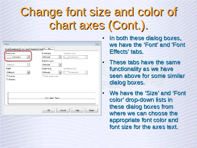
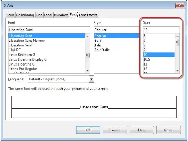
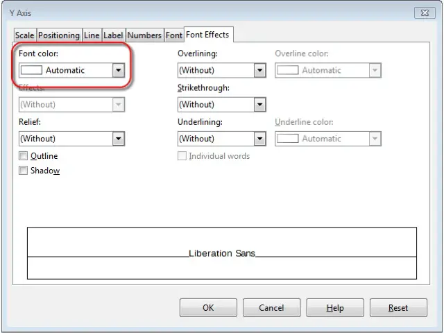
To change the font size and color of the chart axes, we need to follow similar steps. First of all select the chart by double-clicking on it. A grey border should surround the chart upon selection. After this, right click on the axes text and from the resulting menu, click on ‘Format Axis’. Doing this for the x-axis will open the ‘X Axis’ dialog box whereas doing these same steps for the y-axis will display the ‘Y Axis’ dialog box.
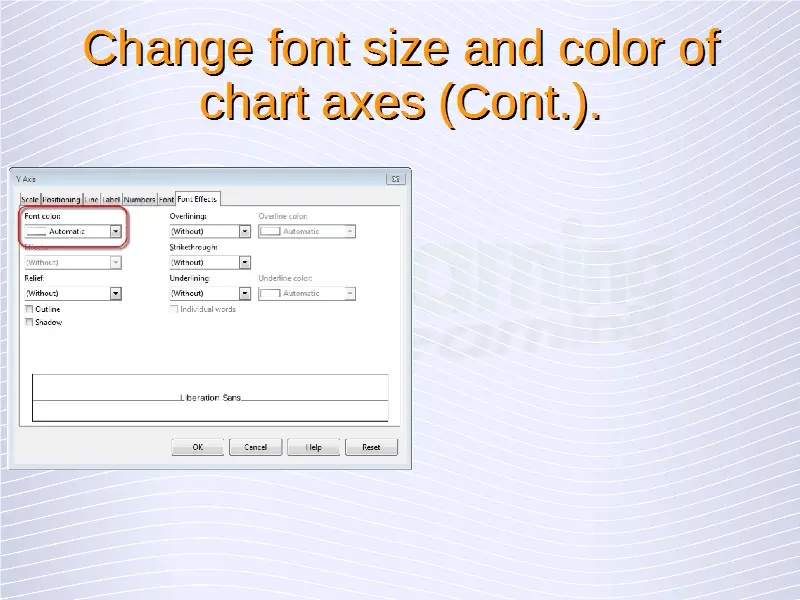
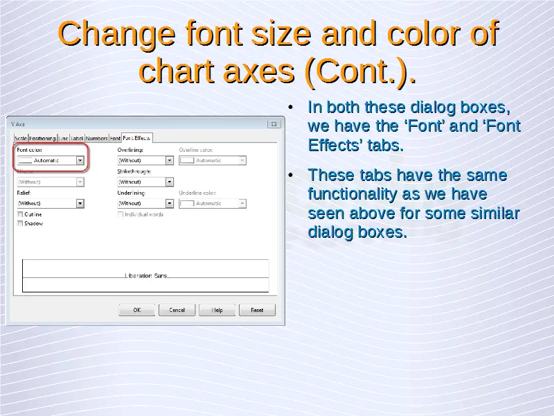
In both these dialog boxes, we have the ‘Font’ and ‘Font Effects’ tabs. These tabs have the same functionality as we have seen above for some similar dialog boxes. We have the ‘Size’ and ‘Font color’ drop-down lists in these dialog boxes from where we can choose the appropriate font color and font size for the axes text.

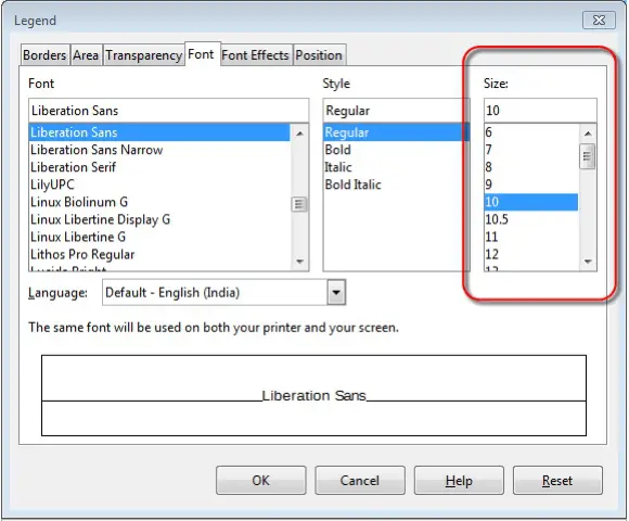
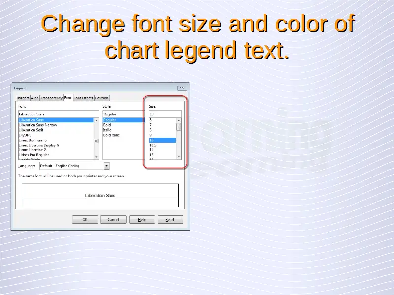
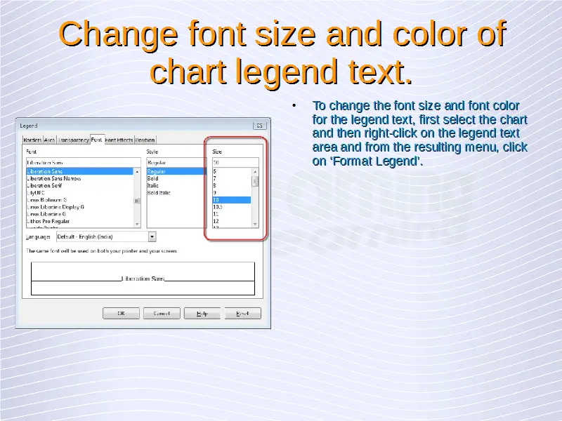
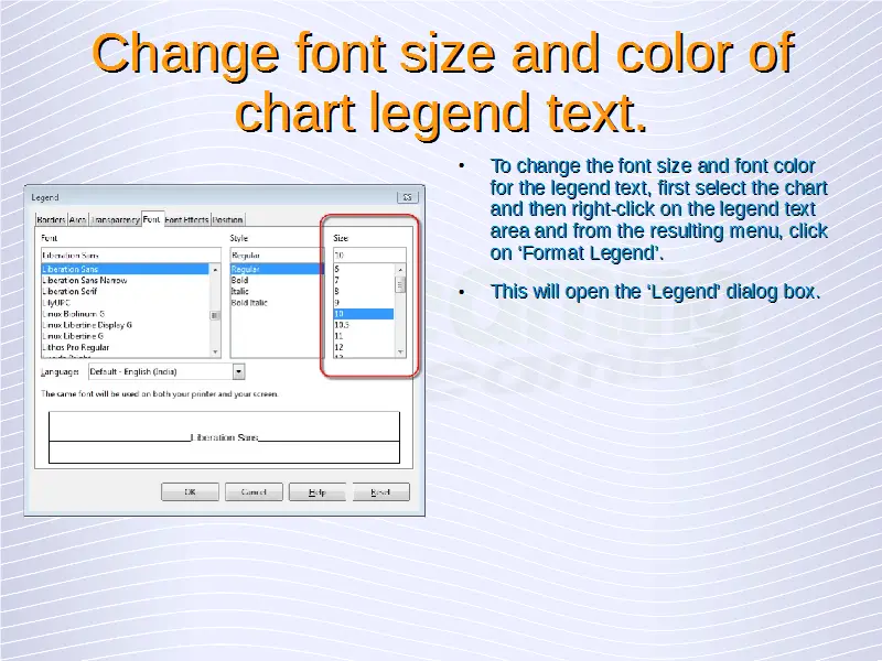
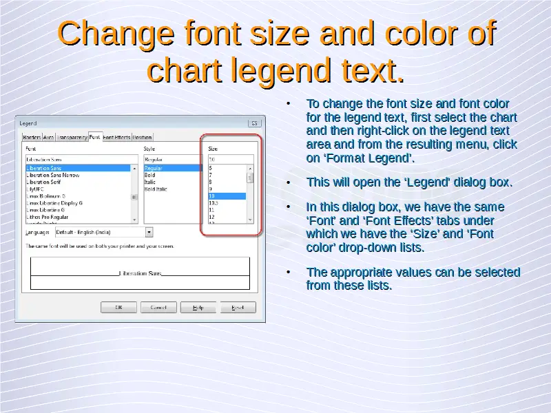
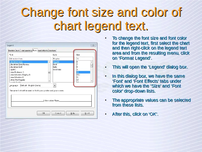
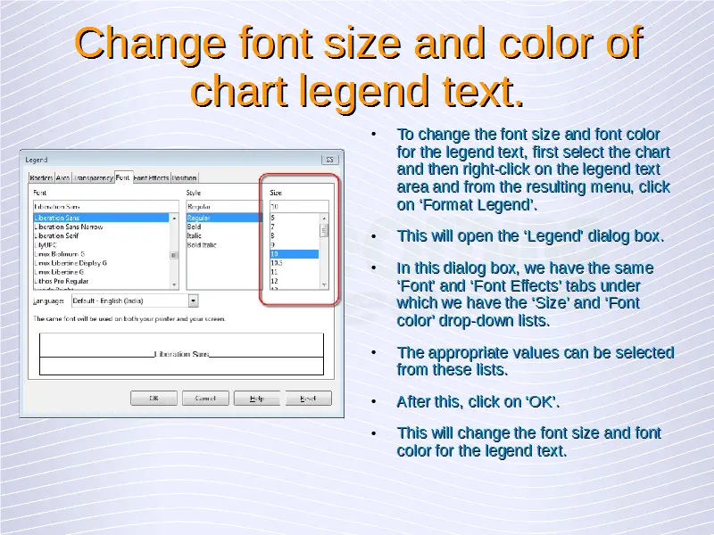
To change the font size and font color for the legend text, we need to follow similar steps as we have seen above. First select the chart and then right-click on the legend text area and from the resulting menu, click on ‘Format Legend’. This will open the ‘Legend’ dialog box.
In this dialog box, we have the same ‘Font’ and ‘Font Effects’ tabs under which we have the ‘Size’ and ‘Font color’ drop-down lists. The appropriate values can be selected from these lists. After this, click on ‘OK’. This will change the font size and font color for the legend text.